My goal for this blog entry is to explain how to organize data within an Excel Spreadsheet (that will be saved as a Comma Separated Values file or .csv) to import into Gephi for visualization and analysis of nodes (individual elements represented as points) and edges (relationships represented by connective lines) in a network. My explanation assumes familiarity with the Gephi tutorials based on prepared .gexf files (the extension for files readable by Gephi) of Les Miserables or Facebook data. I assume that my reader is now thinking about applying network analysis to her own research.
New users of Gephi may not have any familiarity with .gexf files, XML mark-up, or other code for organizing data, but can still find use in Gephi. Excel is typically a more user-friendly application for this kind of organization, and most databases (Microsoft Access for example) can be converted to an Excel workbook (.xls) or directly to a .csv file. The explanations assume a basic understanding of storing, copying, and sorting data in Excel. The organizational principles described below can be applied to whichever application you use to generate the tabular .csv files that you will use in Gephi. Other supported formats and their functionality can be found at Gephi’s site.
I am using screenshots from my own research data on the books in Galileo Galilei’s library to help demonstrate the kinds of information each column should contain. Below is a screen shot of one spreadsheet in the Excel workbook that I have used to organize all of my notes related to the project:
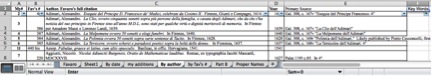 There are many spreadsheets listed in the tab bar at the bottom of the screen for the different kinds of information I have for the project. Importantly, a .csv file only retains the information in the active worksheet (“By author” in this case, the tab in white) and will not save the other sheets. It is important to copy the information you want to use from your primary workbook (multiple sheets) to a single-spreadsheet workbook for nodes and a single-spreadsheet workbook for edges. Also, the column headings in my workbook (“My#”, “Fav’s#”, “Author. Favaro’s full citation”, “Year”, etc.) are my shorthand and cannot be interpreted by Gephi, another reason that copying the information you want to use to new single-spreadsheet workbook files is highly recommended.
1) You will need to create two .csv files: a node table and an edge table. I use Excel as my tabular application, and Excel files save by default to the .xlsx format. In order to get the .csv, you need to choose that option for file format when saving.
2) The node table tells Gephi all of the possible nodes in a network and must have at least the columns Id and Label. There should be one line for every node that will appear in either ![]() column of the edge table:
column of the edge table:
This seems easy enough, but what kinds of information are best placed in the Id column, and how should that differ from the Label? The example above is taken from a spreadsheet that I use to organize information about Galileo’s library. All of my nodes in this example are the proper nouns that are found in titles in the library and the titles themselves (about 2650 nodes total). The example above is, in a word, clunky. It is redundant and ultimately makes my network visualization unreadable if I try to add labels over the nodes. Consider the following example in which full titles would become labels over roughly 650 nodes (obscuring nodes and edges in the process):
Having a unique identifying number (the Id that Gephi expects) allows me to store a lot of information about that node in a spreadsheet or database that I can later choose to access as necessary. Since my organizational system was created long before I knew about Gephi, my Label column corresponds to the Full Title column in my spreadsheet (which ultimately clutters my visualization to the point of illegibility if I add labels). To make this more readable, I need to change the data in the Label column to the data from a “Short Title” column.
3) As you might notice, there are other columns in the first screen shot for the node table. The node table can also include attributes (in parenthesis in the example because they are not necessary for a basic visualization of a network). Attributes are a way to categorize data, perhaps by gender, race, age, etc. While not necessary for exploring data with Gephi, they allow for a more nuanced exploration of a network. For example, I will want to add attribute columns for religious affiliation (Jesuit, Benedictine, Protestant, Catholic, etc.) and genre to start visualizing the data in a way that helps me answer my research questions. Attribute columns can also be added in the “Data Laboratory” section of the Gephi interface even after you have loaded the .csv files for the nodes and edges.
4) The time interval is another optional column of information to include about your data, which may or may not be applicable or useful. I copy here a partial screenshot from the Gephi.org page as a reference: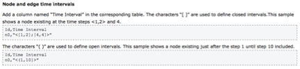
The Gephi wiki also displays the code behind this process.
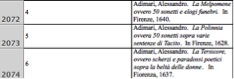
Thinking about my own dataset, I need a Time Interval column for every title that shows the earliest year that a book could have entered the library. I will stop my time intervals with Galileo’s death in 1642. From the examples in part 3, the time interval information would look like this in the .csv version of the spreadsheet, with the columns Id, Time Start, Time End:
4,1640,1642
5,1628,1642
6,1637,1642
Once you have uploaded the .csv, in Data Laboratory, you can merge the Time Start and Time End columns using the merge strategy “Create Time Interval.” This will concatenate and format what you need in order to be able to view the change over time of the network.
5) The edge table (the second .csv file that you need to create) then tells Gephi the connections that exist between the nodes. It must have the columns Source and Target: ![]()
This is where having a unique identifier for all nodes can be very convenient. My source above is title 299 in which the Cologne Academy is mentioned as a contributor to the book that I have given the identifier 299. Book titles can include people or places (Targets), but people or places cannot include titles (Sources), so my edges are directed, and the distinction between source nodes and target nodes is critical.
6) Similarly to the node table, there are many optional categories that can add nuance to an analysis of a network. The edge table can also include a Label column to help with categorization of relationship types, a unique Id for the relationship (generated by Gephi), Attributes (eg: family, friend, co-worker, classmate, etc. for social networks), and Time Interval.
7) The edge table can also include information not found in the node table. Type indicates whether the relationship is directed or undirected. This column can be auto-filled on upload and is visible in the Data Laboratory.
8) Another option for the edge table is to provide weightedness for relationship. Weight is your opportunity to give more importance to certain relationships by giving them a numerical weight.
Remember to save the files as .csv, then load them in Gephi, nodes first, using the “Import .csv” option in the Data Laboratory toolbar. Be sure to indicate which type of file you are uploading (node table or edge table), otherwise you risk error messages.
Data can simply be input directly into the Data Laboratory of Gephi, but I am most familiar with the functionality of Excel, have organized my research data using spreadsheets, and prefer to make adjustments, filter data, and store my information in one format. Programming languages such as R seem particularly adept at creating the tabular information needed here, particularly when automatically pulling data from a large corpus.
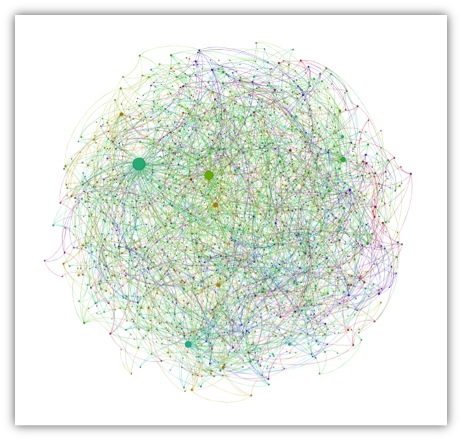
My approach may not work for everyone or every project, but hopefully seeing real data in a raw format provides context for its presentation in the data 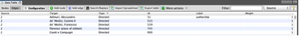 laboratory:
In turn, that should make the analysis of something as complex as the visualization of the connections between names in Galileo’s library less opaque: