• Skip to primary navigation
  • Skip to main content

Digital and Computational Studies Blog

Bowdoin College - Brunswick, Maine

  • Home
  • Research Opportunities
  • Courses
  • Events
  • Faculty and Staff
  • About the DCS Blog
  • Show Search
Hide Search

Digital and Computational Studies Initiative

Digital Humanities Faculty Workshop a Success

January 28, 2014 By jgieseki

Reblogged from the Bowdoin News: “Workshop Gives Faculty the Keys to a Digital World”

Nearly two dozen Bowdoin faculty members are taking a turn as students in a four-day course for faculty titled “Digital Humanities @Bowdoin,” taught January 13-16 as part of the College’s new Digital and Computational Studies Initiative.

It was the first day of class, and five rows of students were seated expectantly – some a little nervously – in a Searles computer lab. “In the next half hour I’m going to teach you everything I know about computers,” said Professor of Computer Science Eric Chown to his audience – which consisted not of undergrads but of nearly two dozen Bowdoin faculty members, representing disciplines such as Romance languages, film studies, art, chemistry, English, history, German, Russian, environmental studies, and math.

Although Chown may have been exaggerating just a little bit for effect, it’s no stretch to say that in today’s increasingly digital world, understanding even the basics of computer science can make a world of difference for scholars and teachers in any field. “Computers are good at things we’re not good at: reading 10,000 books at once, or counting the number of pixels in an image that are more red than green,” Chown said. “They’re fantastic at these things, and these things lead us to think a little bit differently about what we’re studying.”

How do computer programs simplify a complex world into zeros and ones, and how do simple components interact to perform highly complex tasks? What kinds of methods and tools can harness computing power, and what limitations do they face? Those are some of the things that the faculty-turned-students were eager to learn from the four-day workshop “Digital Humanities @ Bowdoin,” co-taught by Chown and Professor of Art History Pamela Fletcher.

Learn About 5 Current Projects in the Digital Humanities at Bowdoin
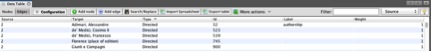
  • Ann Kibbie – English
  • Allison Cooper – Romance Languages
  • Anne Goodyear – Museum of Art
  • Matthew Klingle – History/ES
  • Marilyn Reizbaum – English

dighum photosBWhile some participants came into the class more comfortable than others with digital methods, all were convinced of the need to know more. “The digital humanities is exciting and folks want to know what’s going on, or they want to dip their toe into it – because they see that colleagues at other institutions are doing projects, they see that agencies tend to fund people who are doing digital humanities projects, or they see that their students are interested in it,” Chown said.

So many faculty members wanted to sign up for the course that some had to be turned away. “The level of faculty interest is extraordinary,” said Dean for Academic Affairs Cristle Collins Judd. “It not only reflects a strong commitment to the continued development of faculty research and teaching, but also highlights the important opportunities offered by the Digital and Computational Studies Initiative.”

Since its conception in 2012, that initiative has gained impressive momentum. In addition to the steering committee headed by Fletcher and Chown, two full-time faculty have joined the cause: Postdoctoral Fellow in the Humanities Crystal Hall – whose own digital humanities research has led to her book Galileo’s Library, which will be published in February 2014 – and New Media and Data Visualization Specialist Jen Jack Gieseking.dighum photosD

The initiative also boasted the debut of a full-fledged course in fall 2013: “Gateway to the Digital Humanities,” taught by the same team of professors (read about the student course on p. 14-15 of the Fall 2013 Bowdoin Magazine). The course covered four major categories of digital humanities techniques – image analysis, text analysis, spatial analysis, and network analysis – a breakdown inspired by a November 2012 talk at Bowdoin by digital humanities specialist Anne Helmreich.

Fletcher and Chown had to turn down a deluge of requests from faculty members to sit in on the fall course, prompting them to start thinking about developing a January workshop for faculty. After gleaning some ideas from a Northeast Regional Computing Program consortium in Boston, members of the initiative began drafting a program based on the fall course – which, according to both professors and students, was a resounding success.

The first day of the faculty workshop gave an overview of how computers work and what the digital humanities can accomplish, with some image analysis built in (Chown demonstrated, for instance, a basic way of analyzing the color choices in Rembrandt’s “The Night Watch”).

“Programming is about abstracting, and scaling over and over and over, until you’re doing things that look really complicated – but the individual parts of it are very simple,” Chown said. “What makes programming so exciting in the digital humanities is that you can play; you can try things out. You can reverse the colors of a Van Gogh and find out that he was playing with negative space – something I discovered on my own just by playing around.”

turtles

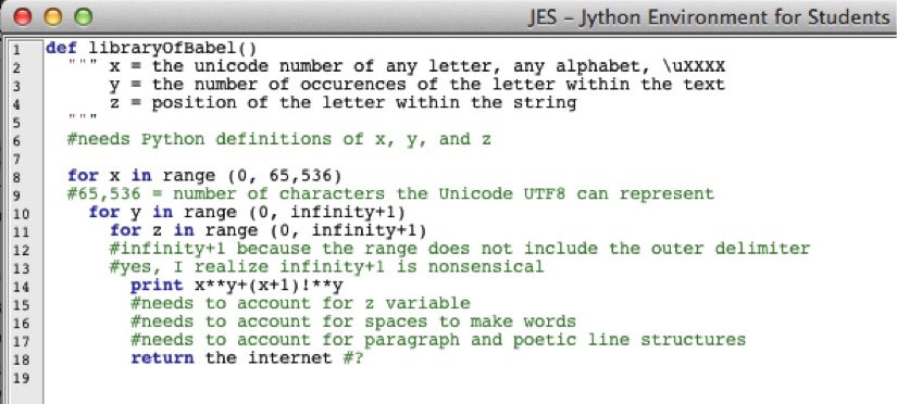
The theoretical overviews were followed by hands-on experience: participants embarked on their first lab assignment and discovered just what it means to operate at a fundamental digital level. By typing in code using the programming language Python, they made tiny neon turtles maneuver around to create geometric shapes on their computer screens.

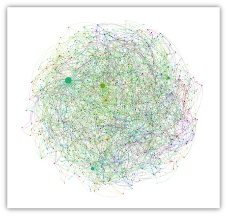
Throughout the rest of the course, participants had an opportunity to hone in on the remaining three categories of analysis. Tuesday covered text analysis – using a tool called Voyant to assess word frequency, for instance – and Wednesday covered spatial analysis, with a special look at GIS projects that participants are already involved in. Today, the final session of the workshop, they’ll cover network analysis, using tools such as Gephi.

dighum photosG
dighum photosF
dighum photosH

The goal of the course is not for everyone to become an expert programmer. It’s about gaining basic fluency in a discipline that’s closely tied to just about every other discipline. “Increasingly, the format for information circulation is digital,” Hall said. “Staying current in any field means at least understanding what’s going on with the digital component – the implications of interface choice, of media choices. It’s incredibly important.”

Just as important as the content covered in the workshop is the opportunity to exchange knowledge and ideas with the instructors and fellow participants. Humanities professors are getting a new perspective on their own fields from computer scientists, and the opposite is also true. “I see the humanities as a great source of ideas,” Chown said. For instance, humanities projects often run up against the limitations of digital tools that aren’t quite suited to the task at hand – providing fertile ground for innovation in computer science.

“The fun thing about this initiative has been gathering up a lot of people from art history, and computer science, and sociology, and earth and oceanographic studies, and all of these other disciplines, and getting them in a room, and having them talk about this stuff,” Chown said. “The ideas that have come out of it have just been phenomenal.”

Digital Reconstructions of Libraries

December 1, 2013 By Professor Crystal Hall

Libraries are very much on my mind these days as I grapple with the best methodologies for reconstructing and visualizing Galileo’s library. I am also working constantly with digital collections: institutional libraries, archives of organizations, and single studies of authors. Perhaps it is no surprise then, that when first asked to suggest possible readings for the section of the Gateway to Digital Humanities Course that focuses on textual analysis, I immediately recommended Jorge Luis Borge’s “Library of Babel.”

To me this short essay represents many of the possibilities and pitfalls of digital and computational library studies. Borges imagines a library that holds one copy of every book that could possibly be written. Some contain gibberish, others perfect copies of known work. Scholars live in the library searching for answers to questions about human experience. Ideological camps form and battles ensue, but all the while, even this hyperbolically complete library remains enigmatic to its users due to its sheer size. In parallel ways, computers have the potential to create a similar digital library. Natural language processing has already shown that computers can generate prose that has the “sound” of known authors like Immanuel Kant. Programming loops (of the kind the Gateway to Digital Humanities students are applying to images) perform the same action repeatedly (changing one pixel at a time, for example) and could conceptually be employed to provide the infinite variety of texts that populate “The Library of Babel.”

For readers of Python programming language, I tried to express this impossible program in loop terms in Jython. Strings and concatenation would help, but I think this still conveys the message in a light-hearted form:

Screenshot (Crystal Hall, 2013) of JES Jython platform.

The above attempt at code (that has legal syntax for Jython, but an error-filled program) is a futile approach for bringing order to chaos. Some Digital Humanities (DH) scholars would argue that digital and computational studies could offer partial solutions to comprehending and organizing this vast quantity of textual information. This is quite optimistic that estimates suggest 340 million new 140-character tweets on Twitter daily, not to mention the 3.77 billion (and growing) indexed pages on the world wide web.

Working even with the available (and manageable) digital data, certain assumptions are made by tools and certain information is lost in their application, all of which gives me pause for thought as I reconstruct and try to find analytical pathways through the library of a person about whom ideological fields have been defined and passionate battles have been fought for centuries. Matt Jockers has led the field of DH with his work on Macroanalytics, currently focused on establishing patterns in nineteenth-century fiction, but relies on only the books for which a digital copy has been made. Google books Ngram Viewer allows users to compare the frequencies of words that appear in digital or digitized books during different time periods, which assumes consistency of cataloguing and meta-data entry across all participating institutions, which is not always the case.

Screenshot (Crystal Hall, 2013) of Google books Ngram Viewer.

As I revisit the data for my own project on Galileo, I wonder where I will enter the ideological disputes that surround the interested fields; I worry about what information will be excluded from the data; and how my users will navigate the digital library I am about to create.


Excel Data and Gephi Data Laboratory

November 15, 2013 By Professor Crystal Hall

My goal for this blog entry is to explain how to organize data within an Excel Spreadsheet (that will be saved as a Comma Separated Values file or .csv) to import into Gephi for visualization and analysis of nodes (individual elements represented as points) and edges (relationships represented by connective lines) in a network. My explanation assumes familiarity with the Gephi tutorials based on prepared .gexf files (the extension for files readable by Gephi) of Les Miserables or Facebook data. I assume that my reader is now thinking about applying network analysis to her own research.

New users of Gephi may not have any familiarity with .gexf files, XML mark-up, or other code for organizing data, but can still find use in Gephi.  Excel is typically a more user-friendly application for this kind of organization, and most databases (Microsoft Access for example) can be converted to an Excel workbook (.xls) or directly to a .csv file. The explanations assume a basic understanding of storing, copying, and sorting data in Excel. The organizational principles described below can be applied to whichever application you use to generate the tabular .csv files that you will use in Gephi. Other supported formats and their functionality can be found at Gephi’s site.

I am using screenshots from my own research data on the books in Galileo Galilei’s library to help demonstrate the kinds of information each column should contain. Below is a screen shot of one spreadsheet in the Excel workbook that I have used to organize all of my notes related to the project:

gephiblog1 There are many spreadsheets listed in the tab bar at the bottom of the screen for the different kinds of information I have for the project. Importantly, a .csv file only retains the information in the active worksheet (“By author” in this case, the tab in white) and will not save the other sheets. It is important to copy the information you want to use from your primary workbook (multiple sheets) to a single-spreadsheet workbook for nodes and a single-spreadsheet workbook for edges. Also, the column headings in my workbook (“My#”, “Fav’s#”, “Author. Favaro’s full citation”, “Year”, etc.) are my shorthand and cannot be interpreted by Gephi, another reason that copying the information you want to use to new single-spreadsheet workbook files is highly recommended.

1)   You will need to create two .csv files: a node table and an edge table. I use Excel as my tabular application, and Excel files save by default to the .xlsx format. In order to get the .csv, you need to choose that option for file format when saving.

2)   The node table tells Gephi all of the possible nodes in a network and must have at least the columns Id and Label. There should be one line for every node that will appear in either gephiblog2column of the edge table:


This seems easy enough, but what kinds of information are best placed in the Id column, and how should that differ from the Label? The example above is taken from a spreadsheet that I use to organize information about Galileo’s library. All of my nodes in this example are the proper nouns that are found in titles in the library and the titles themselves (about 2650 nodes total). The example above is, in a word, clunky. It is redundant and ultimately makes my network visualization unreadable if I try to add labels over the nodes. Consider the following example in which full titles would become labels over roughly 650 nodes (obscuring nodes and edges in the process):

gephiblog3

Having a unique identifying number (the Id that Gephi expects) allows me to store a lot of information about that node in a spreadsheet or database that I can later choose to access as necessary. Since my organizational system was created long before I knew about Gephi, my Label column corresponds to the Full Title column in my spreadsheet (which ultimately clutters my visualization to the point of illegibility if I add labels). To make this more readable, I need to change the data in the Label column to the data from a “Short Title” column.

3)   As you might notice, there are other columns in the first screen shot for the node table. The node table can also include attributes (in parenthesis in the example because they are not necessary for a basic visualization of a network). Attributes are a way to categorize data, perhaps by gender, race, age, etc. While not necessary for exploring data with Gephi, they allow for a more nuanced exploration of a network. For example, I will want to add attribute columns for religious affiliation (Jesuit, Benedictine, Protestant, Catholic, etc.) and genre to start visualizing the data in a way that helps me answer my research questions. Attribute columns can also be added in the “Data Laboratory” section of the Gephi interface even after you have loaded the .csv files for the nodes and edges.

4)   The time interval is another optional column of information to include about your data, which may or may not be applicable or useful. I copy here a partial screenshot from the Gephi.org page as a reference:gephiblog4

The Gephi wiki also displays the code behind this process.


Thinking about my own dataset, I need a Time Interval column for every title that shows the earliest year that a book could have entered the library. I will stop my time intervals with Galileo’s death in 1642. From the examples in part 3, the time interval information would look like this in the .csv version of the spreadsheet, with the columns Id, Time Start, Time End:

4,1640,1642

5,1628,1642

6,1637,1642

Once you have uploaded the .csv, in Data Laboratory, you can merge the Time Start and Time End columns using the merge strategy “Create Time Interval.” This will concatenate and format what you need in order to be able to view the change over time of the network.

5)   The edge table (the second .csv file that you need to create) then tells Gephi the connections that exist between the nodes. It must have the columns Source and Target:   gephiblog5

This is where having a unique identifier for all nodes can be very convenient. My source above is title 299 in which the Cologne Academy is mentioned as a contributor to the book that I have given the identifier 299. Book titles can include people or places (Targets), but people or places cannot include titles (Sources), so my edges are directed, and the distinction between source nodes and target nodes is critical.

6)   Similarly to the node table, there are many optional categories that can add nuance to an analysis of a network. The edge table can also include a Label column to help with categorization of relationship types, a unique Id for the relationship (generated by Gephi), Attributes (eg: family, friend, co-worker, classmate, etc. for social networks), and Time Interval.

7)   The edge table can also include information not found in the node table. Type indicates whether the relationship is directed or undirected. This column can be auto-filled on upload and is visible in the Data Laboratory.

8)   Another option for the edge table is to provide weightedness for relationship. Weight is your opportunity to give more importance to certain relationships by giving them a numerical weight.

Remember to save the files as .csv, then load them in Gephi, nodes first, using the “Import .csv” option in the Data Laboratory toolbar.  Be sure to indicate which type of file you are uploading (node table or edge table), otherwise you risk error messages.

Data can simply be input directly into the Data Laboratory of Gephi, but I am most familiar with the functionality of Excel, have organized my research data using spreadsheets, and prefer to make adjustments, filter data, and store my information in one format. Programming languages such as R seem particularly adept at creating the tabular information needed here, particularly when automatically pulling data from a large corpus.

My approach may not work for everyone or every project, but hopefully seeing real data in a raw format provides context for its presentation in the data gephiblog6laboratory:


In turn, that should make the analysis of something as complex as the visualization of the connections between names in Galileo’s library less opaque:gephiblog7


Emese Gaal on INTD 2401: Gateway to the Digital Humanities

November 13, 2013 By Professor Crystal Hall

Jack Gieseking and Crystal Hall recently spoke with Emi Gaal ’15 about her experience in the new “Gateway to the Digital Humanities” course.

Why are you taking the Gateway course?

As someone more involved in the humanities and social sciences, this class seemed like a nice first segue into the more technical realm of computer science while still focusing on broad objectives in both social and technical sciences. Additionally, I have always wanted to take both a computer science class and an art history class at Bowdoin, as both are very interesting to me, and the interdisciplinary nature of this class has provides a great introduction to both.


What has surprised you in the seminar so far?

I am most surprised by how useful it is to understand the methodology behind programming within programs such as GIS, as it allows the user to be more intentional about the commands he or she aims to carry out. Being more in the “know” about how the whole digital sphere operates is empowering and I believe it will help me better understand the possibilities and limitations of executing projects.

Do you have any early ideas about your final project?

I don’t have an idea just yet, but I think using GIS, as it is a program with which I am already proficient, would prove to be a great tool to incorporate. Also, since we have only covered one other topic, image analysis, aside from spatial analysis, I feel like I should wait until I have a better idea of what the other topics and tools are in which I could dabble before I solidify an idea.


Allan Parnell’s Talk on “Local Political Geography and Institutionalized Racial Inequality”

October 29, 2013 By jgieseki

Last week the Sociology & Anthropology Department at Bowdoin sponsored a pretty fantastic talk by Allan Parnell of the Cedar Grove Institute for Sustainable Communities, a nonprofit social science research firm. Demographer Dr. Allan Parnell discussed the work Cedar Grove Institute (CGI) has done challenging social inequities using GIS & census data. CGI does research & analyses to support legal cases involving civil rights, predatory lending, school segregation, & institutionalized discrimination.

Parnell’s talk, “Local Political Geography and Institutionalized Racial Inequality,” reviewed a series of legal cases in which his and his team’s use of geographical information systems (GIS) and other multi-disciplinary technical analysis of public data to support issues of economic development, fair housing, education, environmental justice, equitable land use, and others. For a detailed summary, check out Jen Jack Gieseking’s Storify record of the event below.

http://storify.com/jgieseking/allan-parnell-s-local-political-geography-and-inst

  • « Go to Previous Page
  • Page 1
  • Interim pages omitted …
  • Page 7
  • Page 8
  • Page 9
  • Page 10
  • Go to Next Page »

Digital and Computational Studies Blog

research.bowdoin.edu