We’re going to Worlds! No website link up yet.
But we’re going to Worlds! This means two more months of 100+ hour weeks in the lab….
But we’re going to Worlds!
We’re going to Worlds! No website link up yet.
But we’re going to Worlds! This means two more months of 100+ hour weeks in the lab….
But we’re going to Worlds!
.flickr-photo { border: solid 2px #000000; }
.flickr-yourcomment { }
.flickr-frame { text-align: left; padding: 3px; }
.flickr-caption { font-size: 0.8em; margin-top: 0px; }
.flickr-photo { border: solid 2px #000000; }
.flickr-yourcomment { }
.flickr-frame { text-align: left; padding: 3px; }
.flickr-caption { font-size: 0.8em; margin-top: 0px; }
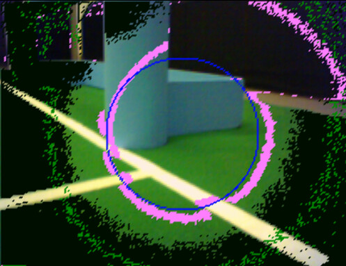
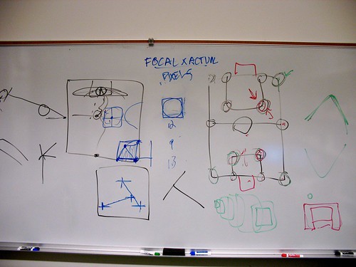
just a few short hours on my improvements to this horizontal/perpendicular to the horizon vision scanning system.
The photo is a first attempt at a post scanning algorithm that starts at the horizon line and then goes upwards and downwards in decreasing frequency scanning parallel to the horizon.
Next up is to give a run structure another go that stores important colors.
The added bonuses of this system are:
1) it fixes the disproportions that show up when you move the head around, thus making the scan lines perpendicular to the ground
2) it scans a lot fewer pixels, hence making the whole vision system much faster
I’m going to see if I can’t get more out of this system this week as I’ll have little to do other than work on vision while the Lab is under construction.
.flickr-photo { border: solid 2px #000000; }
.flickr-yourcomment { }
.flickr-frame { text-align: left; padding: 3px; }
.flickr-caption { font-size: 0.8em; margin-top: 0px; }
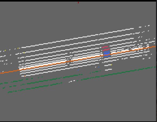
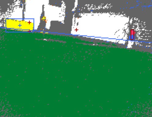
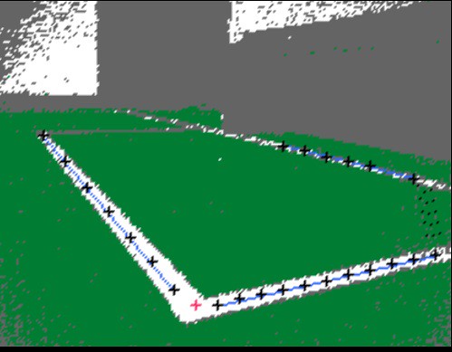
Finally got this issue out of the way — for real this time. Works with all variations of head values. Click here for more horizon images.
.flickr-photo { border: solid 2px #000000; }
.flickr-yourcomment { }
.flickr-frame { text-align: left; padding: 3px; }
.flickr-caption { font-size: 0.8em; margin-top: 0px; }
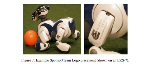
We should get Logo Stickers for the dogs if for no other reason except that they look ridiculously cool. This example is not the greatest (the rUNSWift and the GermanTeam had wayy cooler ones).
So here’s the question, how the heck do we get these made, and what should we put on them?
I’m thinking either the traditional ‘Bowdoin’ font-ed name, or the nBites logo minus the text, or even the Bowdoin sun seal. And remember, if anyone out there wants to pay us an extravagant sum to get their logo on our aibos, feel free to contact us.
UPDATE:: Oh, and here is the official regulations concerning these ads:
Teams may add a black and white logo to the upper part of the leg. This logo must be at least 50% white by area.
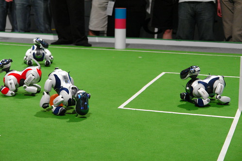
As far as I can tell, the robots are ecstatic.
.flickr-photo { border: solid 2px #000000; }
.flickr-yourcomment { }
.flickr-frame { text-align: left; padding: 3px; }
.flickr-caption { font-size: 0.8em; margin-top: 0px; }
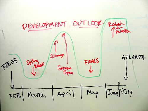
From a small meeting yesterday.
.flickr-photo { border: solid 2px #000000; }
.flickr-yourcomment { }
.flickr-frame { text-align: left; padding: 3px; }
.flickr-caption { font-size: 0.8em; margin-top: 0px; }
.flickr-photo { border: solid 2px #000000; }
.flickr-yourcomment { }
.flickr-frame { text-align: left; padding: 3px; }
.flickr-caption { font-size: 0.8em; margin-top: 0px; }